Bootstrap 布局
网格系统
平面设计排版会使用网格系统,元素会依据预设的格线进行排布。
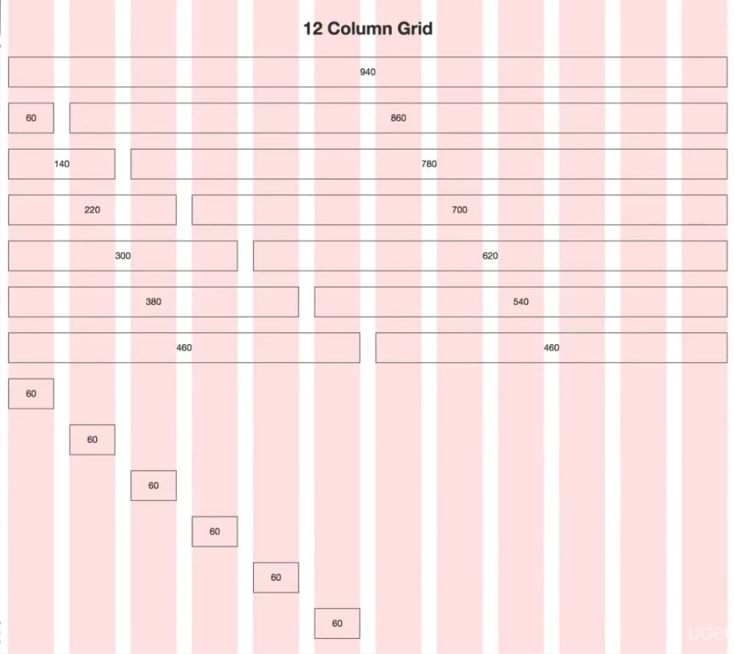
在早期屏幕宽度(分辨率)为 1024px,因此一般基于 960px 的网格系统进行网页设计。其中网格栏数/列数为 12(因为它是较多数字的公倍数方便通过不同栏数组合实现不同排布,如左右等距、三列等距……)。
相关参数:
- Total Width 总栏宽(去除左右外边距各 10px)为 940px
- Column Width 栏宽/列宽为 60px
- Gutter Width 列间距为 20px,Gutter on outside 最外侧列边距一般为一半值,即 10px
- Number of Columns 总栏数量为 12
Bootstrap 排版使用的网格系统是由平面设计的基础概念发展而来的,即将一行分为 12 栏,通过相应的属性组合可以实现不同的排版方式
使用规则
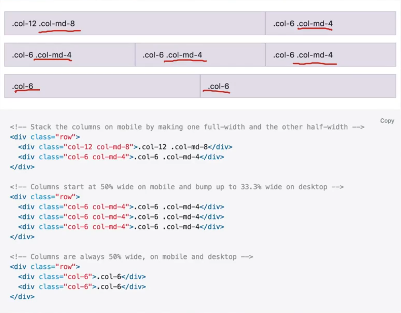
Bootstrap 的网格系统使用一系列容器 container、行 row、和栏 col-n 属性(n 范围从 1~12 分别表示该元素/栏的宽度在 12 列布局中占比多大)
Tip
Bootstrap 网格布局是基于 flexbox 建立的,而且完全符合响应式(可以栏属性添加中断点关键字,如 col-lg-3 表示在较大 lg 视窗时该栏宽度占比为 3/12)。
<!-- 一行三列的布局 -->
<div class="container">
  <div class="row">
    <div class="col-sm">
      One of three columns
    </div>
    <div class="col-sm">
      One of three columns
    </div>
    <div class="col-sm">
      One of three columns
    </div>
  </div>
</div>
- 在同一行的列元素
class="col-xx"需要包括在行元素class="row"内 - 列元素只能作为框架,页面的内容/元素需要放置在其内(而不能直接将列元素作为其他),不然会造成空间「补回」和 flexbox 布局失效
- 整个网格布局应该放置在一个
class="container"容器中,以限制网格宽度大小(避免由于内容过多造成网格过宽,使得网页出现卷轴),而且容器会补充行元素设置的负外边距,并容器会再添加 Gutter 外边距使得网格布局更美观。
Tip
如果为列元素 .col-auto 添加了 auto 后缀,列宽度会基于内容多少自动调节宽度。
Warning
需要在 .col 外包裹 .row 类的元素,因为 Bootstrap 通过为每个列元素设置内边距构成 Gutter 列间距,并通过在行元素上设置负外边距,让列元素在左右最外侧多出的内边距「缩回」,这样才可以让每一行总宽度一致
.row {
    margin-right: -10px;
    margin-left: -10px;
}

.col-* {
    padding-right: 10px;
    padding-left: 10px;
}
响应式
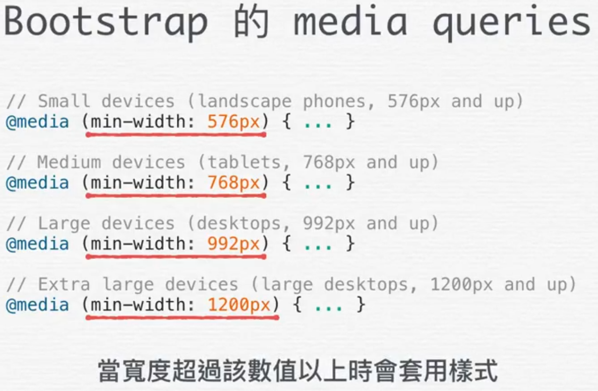
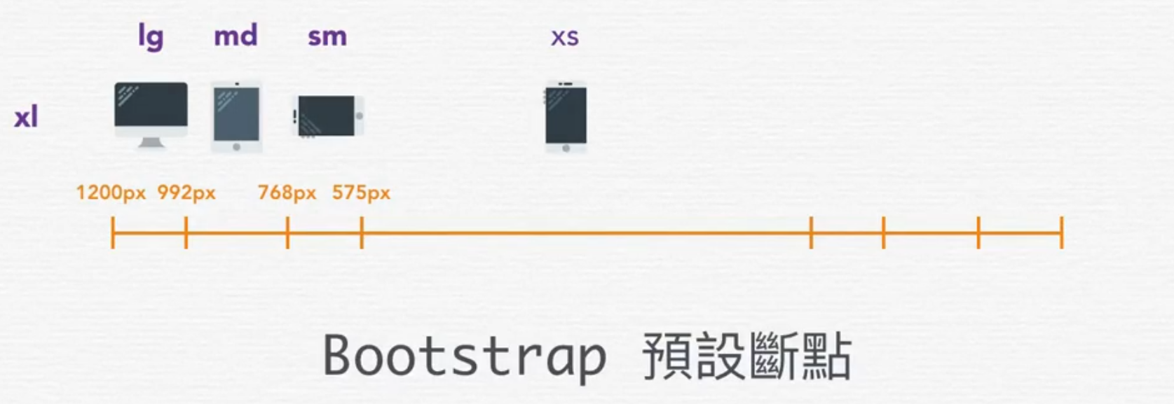
Bootstrap 基于移动优先的设计理念,即其样式设置一般适用于最小尺寸的设备,即默认针对最小断点 xs 。此外 Bootstrap 提供了许多中断点,可以在设置相应样式类属性时作为关键字插入,这样就可以在窗口(宽度)超过相应的大小时才套用该样式。在使用网格系统时可以为列元素添加关键字 xs(省略)、sm、md、lg、xl 实现在特定的视图下不同布局。
以上示例实现了一个响应式网格布局,在网页宽度大小大于中断点 md 时以一行 4 栏的形式排布,而网页宽度小于中断点 md 大于 sm 时以一行 2 栏排布,最后如果网页宽度比中断点 sm 还小就会以一行 1 栏的方式排布。
Flexbox 布局
Bootstrap 4 与前一版最大的差别在于新版使用 Flex 实现网格布局(而上一版使用 float),因此在 Bootstrap 第 4 版中除了可以在网格系统中适用 Flexbox 技术,它还提供了多种相关的类,以方便地实现多种相应的 Flexbox 排版。
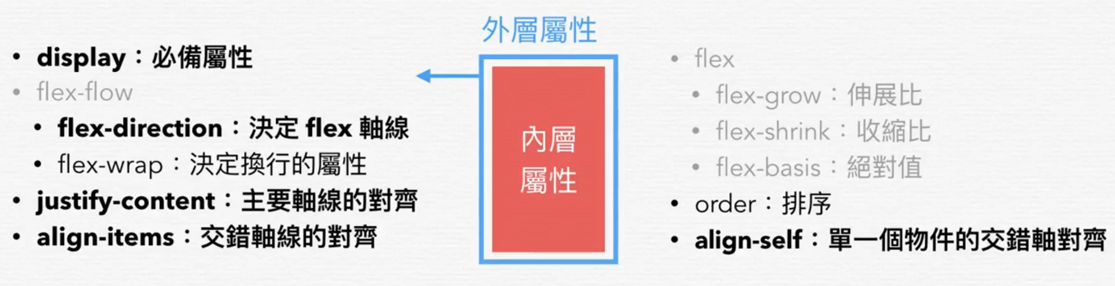
Flex 容器属性
| 对应的 CSS 属性 | Bootstrap class 组合规则(一般结合中断点) | Bootstrap 实例 |
|---|---|---|
flex | .d-{size}-flex | .d-sm-flex 或 .d-inline-flex |
flex-direction | .flex-{size}-{属性值} | .flex-row、.flex-row-reverse、.flex-column、.flex-column-reverse |
justify-content | .justify-content-{size}-{属性值} | .justify-content-start、.justify-content-end、.justify-content-center、.justify-content-between、.justify-content-around |
align-items | .align-items-{size}-{属性值} | .align-items-start、.align-items-end、.align-items-center、.align-items-baseline、.align-items-stretch |
flex-wrap | .flex-{size}-{属性值} | .flex-nowrap、.flex-wrap、.flex-wrap-reverse |
align-content | .align-content-{size}-{属性值} | .align-content-start、.align-content-end、.align-content-center、.align-content-around、.align-content-stretch |
Tip
align-cotent 设置容器中的内容在交叉轴的对齐方式,类似 align-items(设置容器中的项目在交叉轴上的对齐方式),但它只在了样式 flex-wrap: wrap 时才生效
flex 项目属性
| 对应的 CSS 属性 | Bootstrap class 组合规则(一般结合中断点) | Bootstrap 实例 |
|---|---|---|
align-self | .align-self-{size}-{属性值} | .align-self-start、.align-self-end、.align-self-center、.align-self-baseline、.align-self-stretch |
order | .order-{size}-{数值} | .order-1、.order-2、.order-lg-3 |
Tip
通过 row、col 一系列属性搭建的网格布局中,默认采用 flex-wrap: wrap 样式,即网格布局是自动换行的;而在容器中使用 d-flex 属性实现的 Flexbox 布局中并没有默认换行,可以为容器添加类属性 .flex-wrap 实现自动换行。
Warning
必须先在容器中设置 .d-flex 类或使用网格模板(由 .row 和 .col 类),相关的样式类才可以生效
Tip
在 Flexbox 布局中,为 flex 项目设置外边距可实现推移,可以通过.offset-n 或 margin 通用類別来实现。使用前缀 offset 设置推移的宽度(基于 12 列布局),如 offset-4 将元素增加四栏位移;当为其中一个项目设置外边距为 auto ,如将项目左侧的外边距设置为 ml-auto 就可以将相应一侧的元素「推开」到一端,巧妙地实现 flex 项目左右布局的样式;
定位
Bootstrap 支持使用 position 对元素进行定位,其中提供了三种类属性以设置https://getbootstrap.com/docs/4.4/components/navbar/
.fixed-top固定在顶部.fixed-bottom固定在底部.sticky-top当父元素向上滚动到顶部时,贴齐到可视区的顶部直至容器离开页面(或向下滚动)
Tip
IE11 和 IE10 将position: sticky 当作 position: relative 使用。